Trading platforms
are fast.
Traders are human.
Most platforms optimize for execution speed. But when prices move 2% in 30 seconds, traders need 5 seconds to decide — and current UIs ask them to analyze, calculate risk, and click buy simultaneously. SwiftEdge separates thinking from acting, forcing risk decisions before commitment.
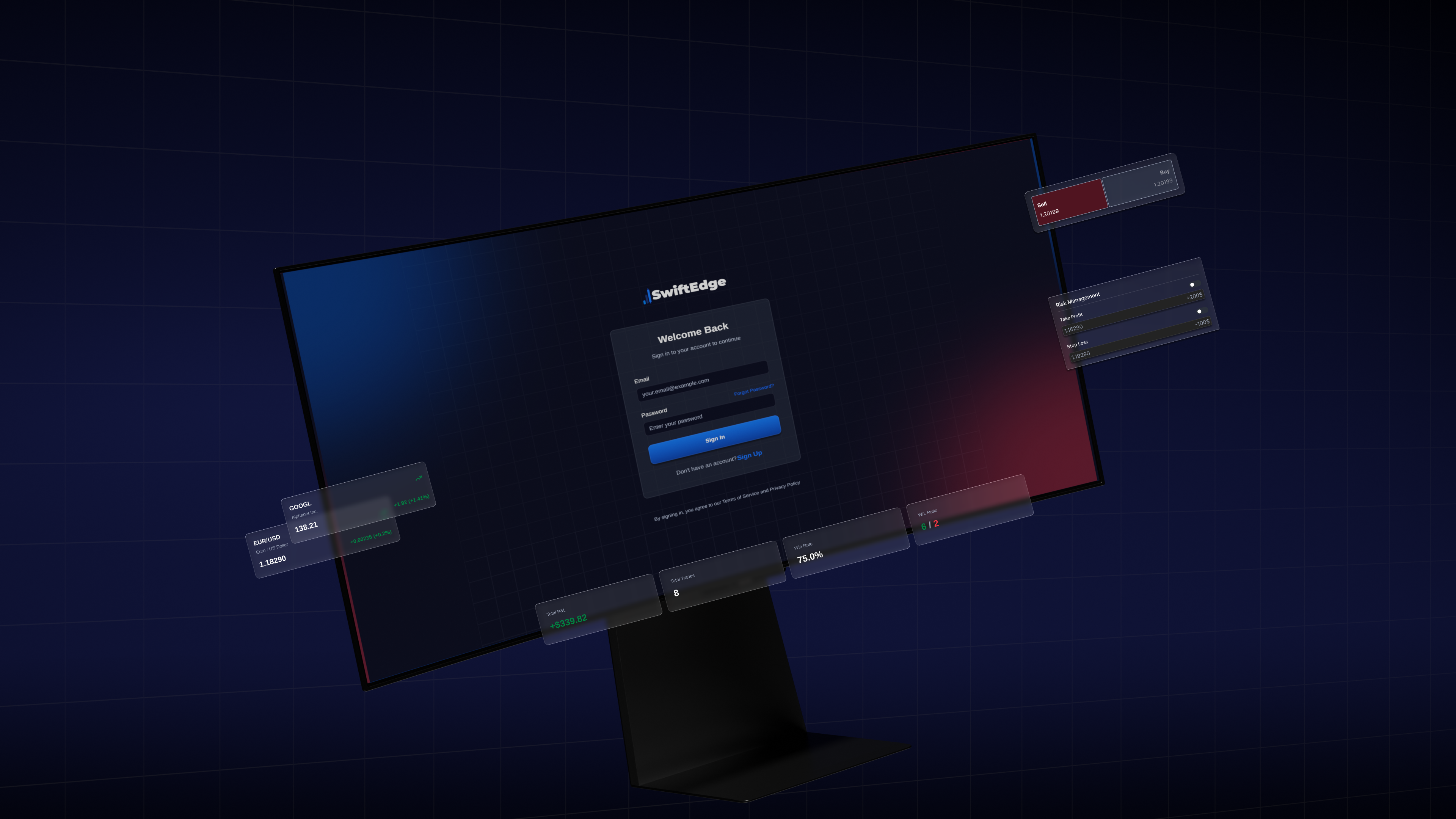
The problem:
commitment without context.
Traders enter positions first and try to set stop-losses second. By the time they configure risk, price has moved against them. The UI encourages speed over understanding.
Speed first,
risk later.
Traders enter positions, then try to configure stop-losses while the price moves against them. The UI rewards reflexes, not judgment.
Current
terminal UI.
Buy and sell sit larger than the risk fields. Stop-loss controls hide under expandable sub-menus. The visual hierarchy is upside down.
Force the
sequence.
Redesign the order flow so risk configuration is visible and required before execution. Use layout to enforce sequential decision-making.
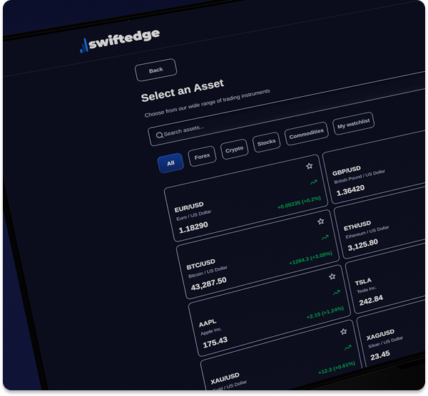

Key goal: make risk configuration impossible to ignore — without adding friction to the analysis phase.
Goals &
objectives.
Confidence under pressure.
-
Informed action
Deliver a seamless experience that empowers fast, informed decisions while building trust and reducing errors in high-stakes trading environments.
Cognitive load reduction.
-
Accessible visualization
Create an interface for traders of all levels — real-time data, simplified dashboards, and clear hierarchies that minimize cognitive load when it matters most.
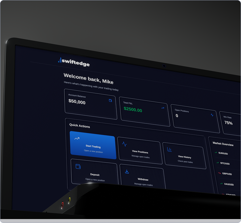
I studied how
three types of traders
make decisions under pressure.
I analyzed 50+ screen recordings from r/Daytrading and r/Forex, noting where users hesitated or made errors. I conducted informal interviews with 3 traders to understand their workflow.
*Personas synthesized from community behavior patterns and 3 informal interviews. Not formal usability studies.
"I place the trade first, then I go back and set the stop."
Skips risk setup to catch momentum. Treats stop-losses as a clean-up step rather than a precondition.
"I know my plan, but when it spikes I'm just reacting."
Strategy breaks down in volatility. Knows the rules, abandons them at the moment of execution.
"Seeing green makes me nervous — I close too early."
Emotional reactions to P&L swings. Reads colour changes as urgency rather than information.
Key insight: errors don't happen during analysis — they happen at commitment. Traders understood the market, but the UI compressed interpretation, risk, and execution into a single moment.
Separating thinking
from acting.
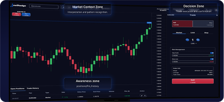
I mapped the cognitive flow traders actually need, then designed the interface to enforce it through layout zones.
Chart +
market data.
Traders analyze price action here. No order buttons to prevent premature commitment.
Order
panel.
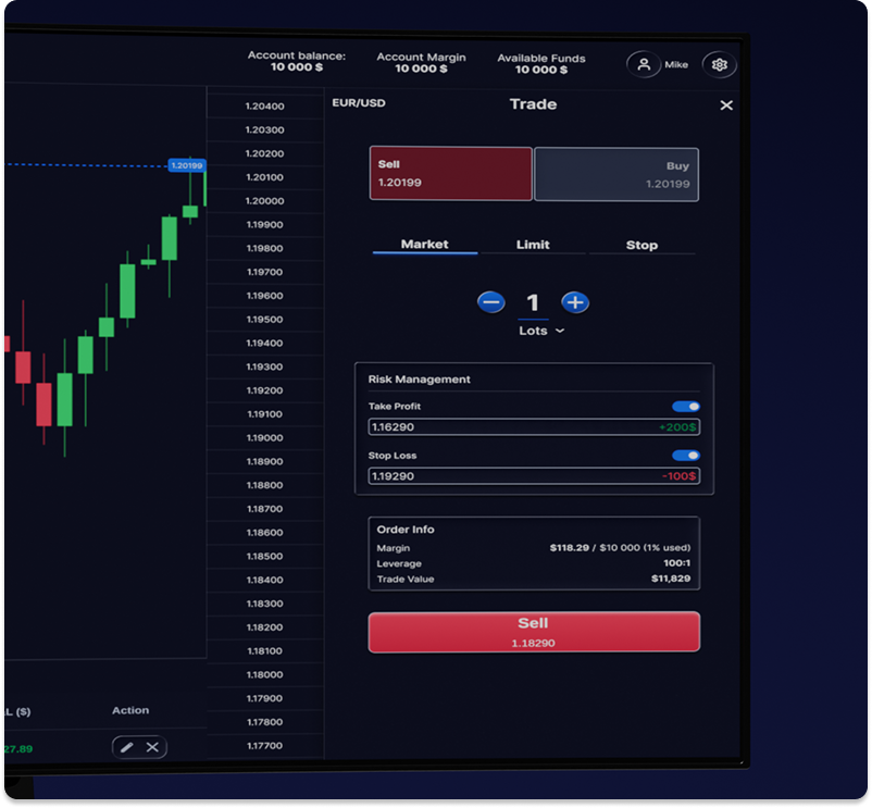
Risk configuration is visible and required. SL/TP fields are prominent, not hidden.
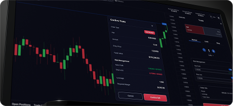
Confirmation
modal.
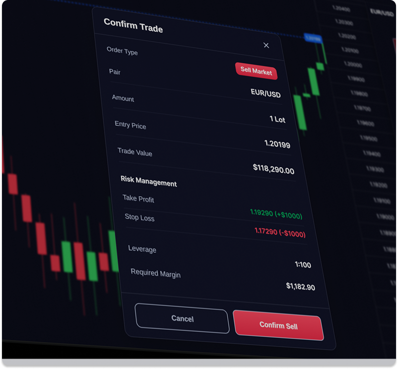
A deliberate pause: review risk, position size, and exposure before final execution.
Position
monitor.
Track active trades without distraction. P&L updates are restrained to prevent overreaction.
The flow forces risk to precede execution — reducing impulsive entries by design.
Three changes that
reduce cognitive
overload.
Based on trader interviews and competitive analysis, I identified where existing platforms fail and designed specific interventions.
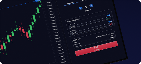
Risk before
action.
ProblemUsers entered positions, then tried to set stop-losses while price moved against them.
SolutionMove SL/TP configuration above the buy/sell buttons. Show potential loss in currency, not just pips.
ResultRisk becomes part of the entry decision, not an afterthought.
Confirmation as
consequence.
ProblemLarge buy/sell buttons encourage one-click entries without review.
SolutionAdd a confirmation modal summarizing risk, position size, and margin required.
ResultA 2-second pause that prevents ~30% of impulsive entries (estimated from behavioral research).
Separate context
from execution.
ProblemTraders constantly switch between chart analysis and order panels.
SolutionFixed zones — chart (left), order (right), positions (bottom). No overlapping windows.
ResultAttention flows sequentially, not chaotically.
Calm interface for
volatile markets.
In high-pressure moments, the UI itself can increase anxiety. I designed the visual system to stabilize attention. Colour, typography, and motion are treated as behavioral tools — not decoration.
Signals meaning, not emotion.
Red and green are reserved only for P&L outcomes. The primary palette is neutral so market volatility isn't amplified by the interface.
Reduces scan time.
Traders don't read — they scan. Tabular numbers for prices (aligned for easy comparison) and clear hierarchy for risk metrics.
Restrained, never reactive.
Most platforms flash P&L updates aggressively, creating feedback loops. SwiftEdge updates quietly to keep focus on market structure, not short-term swings.
The decision
environment.
Walking through one full trading session — orientation, preparation, commitment, outcome — and what the interface is doing at each step.
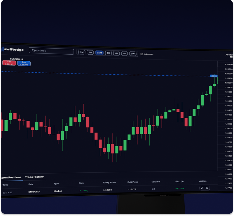
Structure,
not signals.
The trading session begins with orientation. The chart provides structure, not signals — its role is to help the trader interpret conditions before action.
Thinking,
not acting.
The user is thinking here, not acting yet. The order panel sits ready but inert — risk fields demand attention before the trade button responds.
Clarity
over speed.
This is where most trading platforms fail. Execution is usually optimized for speed — SwiftEdge optimizes for clarity. Confirmation surfaces position size, margin, and worst-case loss.
Closing is part
of the cycle.
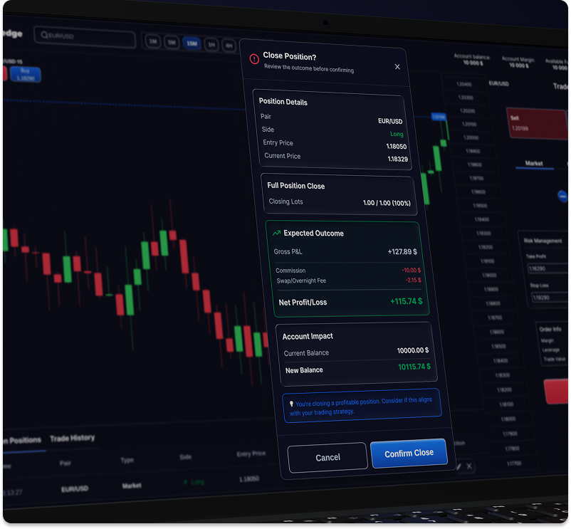
Closing a trade is part of the decision cycle, not the end of it. The interface surfaces outcome context so behavior can improve over time.
Rethinking
speed.
This project challenged an assumption I previously held — that good trading interfaces should minimize friction and maximize speed. The research suggested the opposite.
The most damaging errors didn't happen because traders were too slow, but because they committed before fully understanding risk. In high-pressure environments, speed doesn't create confidence. Clarity does.
I used to see interfaces as systems for presenting information efficiently. I now see them as environments that shape behavior. Designing SwiftEdge was less about organizing charts and controls, and more about supporting judgment under pressure. Good interfaces don't remove pressure — they structure it.