Engineered
for
performance.
Redefining how athletes shop for performance wear. A comprehensive design sprint focusing on streamlining the checkout flow and enhancing product discovery on mobile.

Why existing gymwear apps
fail the serious athlete.
Users struggle to find technical specifications for gym clothing on mobile. The current market prioritizes lifestyle imagery over product data, leading to high return rates and user frustration. The "serious athlete" persona needs precision, not just inspiration.
Sizing
uncertainty.
Users cannot visualize fit on different body types. Generic size charts fail to convey technical fit on a serious training body.
Hesitation
at the tap.
Inconsistent photography and unclear material breakdowns lead to significant purchase hesitation — and quiet abandonment.
Information
overload.
Promotional pop-ups and lifestyle content obscure key specs and make decision-making harder, not faster.
"I just want to know if the inseam fits before I buy, but have to scroll through 10 photos of models to find one number."
Goals &
objectives.
The primary mission was to redefine mobile shopping for fitness enthusiasts. By focusing on friction-free navigation and crystal-clear product data, the goal was to bridge the gap between browsing and buying.
Less,
seen better.
Reduce visual clutter so users focus entirely on high-quality product imagery and essential technical details.
Tap to
checkout.
Optimize checkout paths and implement one-tap add-to-cart so click-to-purchase is reduced to the shortest viable path.
Truthful
by default.
Clear sizing guides, real-time stock levels, and honest product descriptions build immediate user trust.
The Efficient
Explorer.
Understanding core personal requirements, lifestyle patterns, and shopping behavior.
Shops primarily from a phone — commuting, on breaks, at the gym. Moves quickly between tasks and workouts. Values fast load times, frictionless checkout, and brands that show specs as confidently as they show lifestyle.
- Find durable, sweat-wicking fabrics for HIIT.
- Discover sustainable brands without digging through PDPs.
- Minimize time on checkout and returns.
- Inconsistent sizing charts across brands.
- Cluttered, lifestyle-heavy interfaces.
- Lack of detailed product information.
- Mobile-first — phone is the primary screen.
- Values speed: load, find, decide, buy.
- Returns to brands that respect their time.
Information
architecture.
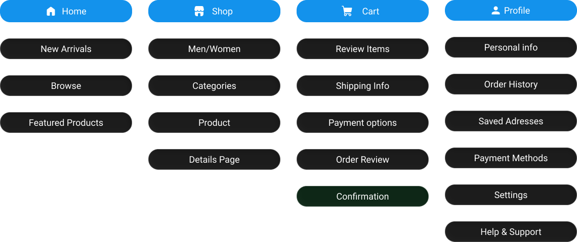
A streamlined navigation structure for the EFP mobile app. The goal: reduce friction between discovery and checkout by organizing content and ensuring an easy, fast checkout process.
Product
discovery.
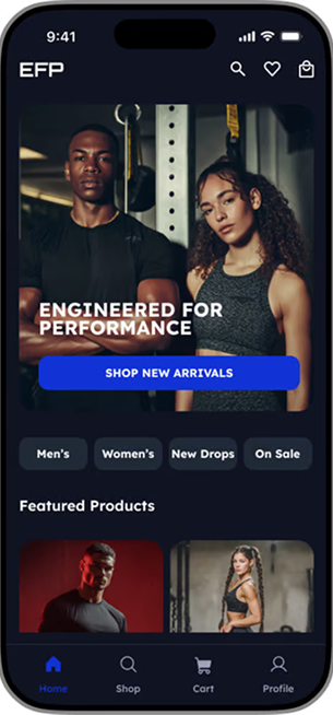
Designed the discovery experience to help users quickly find relevant training gear with minimal friction. Navigation prioritizes clarity and performance-driven browsing, enabling users to explore collections and new drops in just a few taps. The home screen acts as a funnel — category tabs, key collections, and featured products guide exploration.
Checkout
experience.
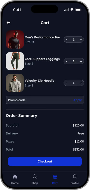
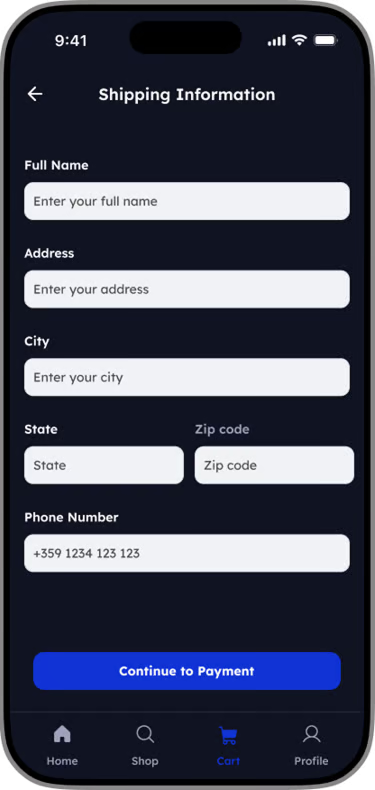
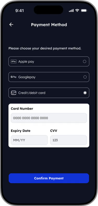
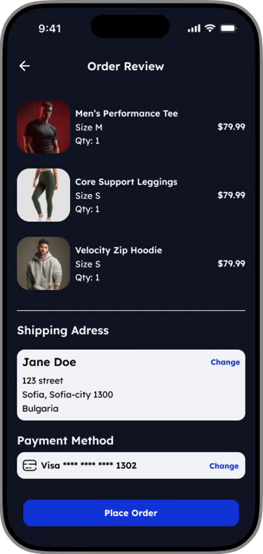
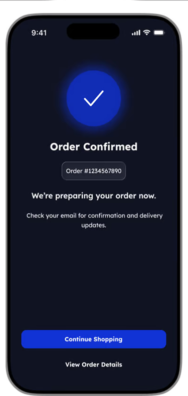
A streamlined checkout flow designed to reduce friction and keep users focused on completing their purchase. Clear hierarchy, fewer steps, and consistent actions improve confidence and speed.
Streamlining
the post-purchase
experience.
Centralized
account hub.
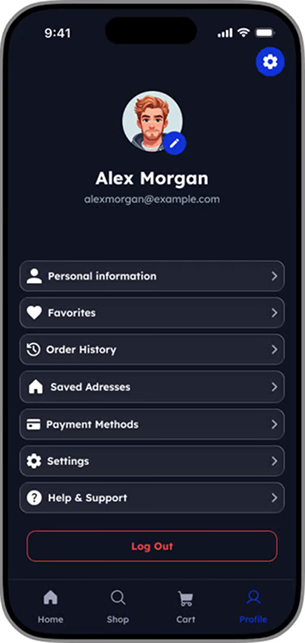
The profile screen acts as a centralized hub where users manage personal details, preferences, and orders with minimal cognitive load. The layout prioritizes clarity and accessibility.
Grouped navigation surfaces common features (order history, saved addresses, payment methods) to support repeat purchases, while settings and support sit lower to reduce clutter.
Glanceable
order overview.
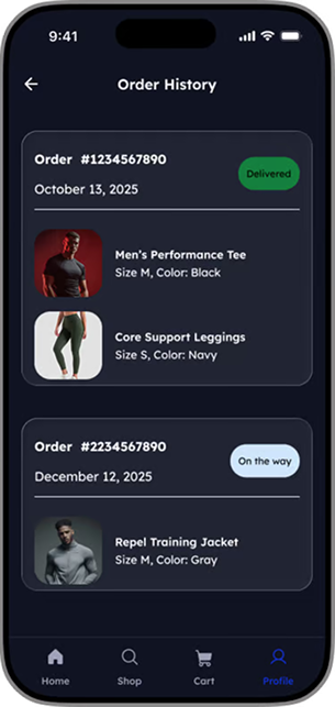
Orders displayed as individual cards so users can scan status, date, and total at a glance. Prominent status labels provide immediate feedback on progress, and active vs. completed orders are visually distinguished to help users prioritize.
This card-based layout supports fast recognition, easy tap targets, and future scalability (track, revisit, reorder) with minimal effort.
From saved
to shipped.
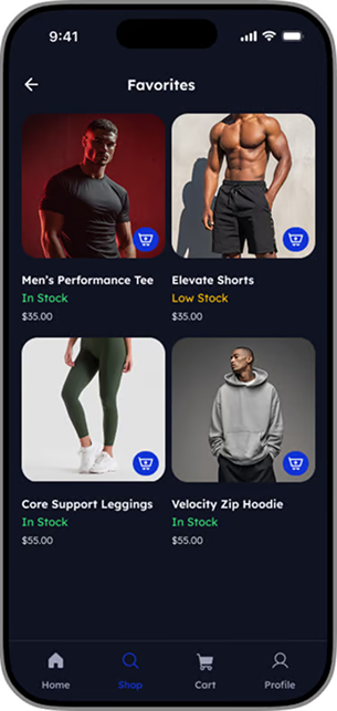
Designed the wishlist experience to reduce friction between saving an item and buying it. The favorites list helps users check stock levels and move items to the cart without leaving the page.
Failure &
error states.
Errors are inevitable. How an interface handles them shapes whether the user comes back. I designed each failure state to reduce frustration and surface a clear path forward.
Reassure,
then re-route.
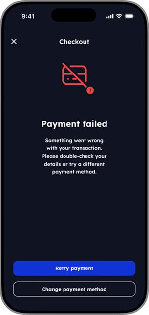
Clear, neutral messaging reassures users that their order has not been lost — while avoiding technical or blame-focused language.
Actionable next steps are presented immediately, allowing users to retry payment or switch methods without leaving the checkout flow. Limiting choices to two clear actions helps users recover quickly with minimal friction.
Visible without
being noisy.
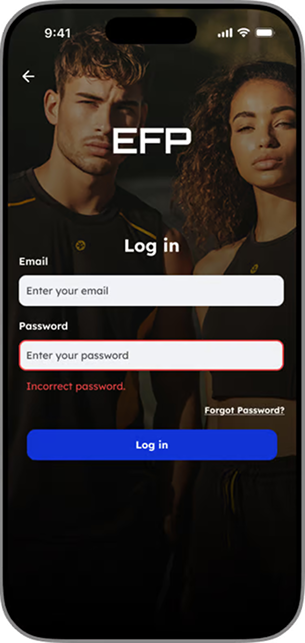
This error state uses a high-contrast border combined with clear, contextual messaging to immediately inform the user of a credential mismatch — while keeping the recovery path visible and accessible.
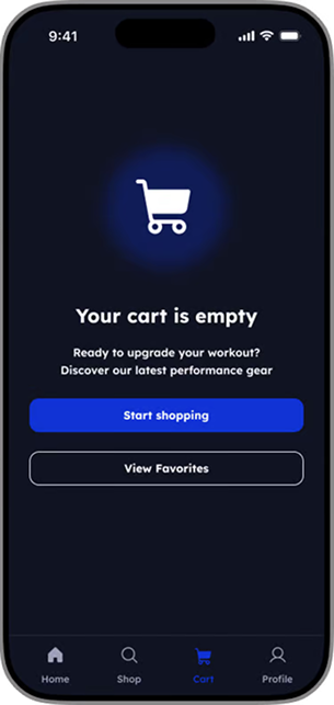
Dead end
to detour.
Turning dead ends into opportunities. Illustration and clear, encouraging copy were used to reduce drop-off and guide users back into product discovery when their cart is empty.
Key
takeaways.
Designing EFP reinforced something I'd been circling for a while: aesthetic complexity is not the same as good design. The athlete who buys gymwear at 11pm on the train isn't impressed by hero animations — they're impressed by inseam numbers, stock confirmation, and a checkout that knows their address.
Prioritizing user needs over aesthetic complexity led to a more intuitive and satisfying shopping experience — one where every screen earns its place by removing a question instead of adding one.
Lessons that stuck: the importance of user-centric design, the value of simplicity in navigation, and the need for clear, actionable feedback during error states. Future iterations would test personalization in the discovery flow and richer fit prediction at the PDP.
Open Figma prototype→